So you’ve built a fabulous website with all the bells and whistles, you work hard to build traffic and get people to read your blog and look at your offers, but all they do is bounce off and buy from your competitor? I know the feeling. It is frustrating, but it is solvable, and in many cases, the solution is simpler than you think. Let’s look at some of the common reasons why your website is not generating leads.
This post was orginally written and published 27/01/2017 by Arvid Linde, and was updated 22/05/2021 by Stephen Bavister
1. Confused calls to action
When we investigate pages with low conversion rates, our first port of call is to analyse the calls to action (CTA). There are two widespread mistakes website owners are making:
They have too many CTAs on a single landing page. The general rule is – one CTA per page. If you want a visitor to make a purchase, your CTA should be “buy now”. There is an exception to the rule; however, you will need to test it if you want to use it. A longer landing page can potentially have the so-called “next best thing” call to action.
For example, if you’ve built a vast landing page with multiple sections and the visitor has scrolled down past 90% of the content, you can assume she won’t follow through with the primary CTA. In this case, you can offer a lower-barrier CTA to convert this visitor at a later date.
Another alternative we see some businesses using successfully is a popup triggered by the mouse cursor movement. If a visitor looks like she’s heading to the dreaded cross icon in the corner of the tab, you can try to catch her attention with a popup.
In all other cases, especially on short landing pages, stick to the single CTA rule. As long as that CTA is well aligned to the page’s content, you’ll see that the landing page starts generating leads.

2. The CTA is too vague or too weak
One of the popular reasons your website is not generating leads is using weak CTAs. How many times have you seen a consultancy’s landing page where the lead capture form has an uninspiring grey action button reading “Submit”. Not only does this word have a subconsciously negative connotation, but it is also very passive and unexciting.
The button should be active and tell the visitor exactly what she needs to do. If it’s a purchase, it should read “buy now”. If it’s an ebook, it should read “download your free copy” and so on. Of course, I’m generalising it right now. You will need to test the language and design of your CTAs to understand which CTA works best for each landing page.
3. Complicated web forms
It may be tempting to make your sales team’s life easier by including several dozen form fields to capture visitor’s information in its finest detail. However, research shows that simple web forms perform much better than their “all-inclusive” counterparts.
Design your lead capture form with as few fields as you can get away with. Would your inbound sales process suffer a meltdown if you only captured the prospect’s name, email address and phone number with a proviso that the number of leads generated by your website increased five-fold? You’d be surprised how much difference this redressed balance can make to your downline.
Besides, if you’re working to improve your B2B lead generation, most Customer Relationship Management (CRM) solutions can pull in additional information just based on the lead’s email address. For example, here at LexisClick, we’re using HubSpot as our CRM. If we add a new lead to the system, there is a good chance it will find additional information like company name, social media accounts, business phone numbers etc.
A great way to evaluate the performance of a web form is to install a website recording system like Hotjar – which is a code snippet that you embed in your pages that contain lead capture web forms. Hotjar records the visitors’ behaviour and helps you understand which features of your lead capture mechanism confuse your website visitors and need repair.
When doing user experience (UX) audits for clients, we often come across high drop-off rates on forms containing more than five fields. The user experience of your landing pages and web forms is crucial to understand when you are working to increase the leads your website is generating for your consultancy.
Web form examples
To illustrate the point I'm making, let's look at these two flight booking forms. While they aren’t in the consultancy space, they serve to highlight that complicated website forms are unlikely to serve you well. The first form is by American Airlines.

And the second is Ryanair's booking form:
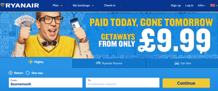
They are both designed to accomplish the same thing - book a flight. Which one do you think has a better conversion rate - the one with 13 confusing form fields or the one with two fields?
4. The main reason your website is not generating leads: not enough traffic
When you think about lead generation for your consultancy, think about a funnel. You get 100 people to visit your homepage; ten will navigate to a specific product or services page, and one visitor will submit an enquiry form. For some consultancy sectors, one per cent is a decent conversion rate. You can try to optimise the product page, change colours, change the CTA, and nothing happens – you’re still stuck with one lead. Why? You need more traffic. It comes down to maths – if one hundred visitors generate one lead, you’ll have ten leads if you get one thousand visitors.
The thing is that you don’t need any traffic. You can easily buy one thousand random visitors from one of many websites out there, yet it won’t make any difference to the leads you generate. That’s why we are proponents of inbound marketing – a strategy that concentrates on adding value through helpful content (think blogs, how-tos and a well-executed social presence). The beauty of inbound marketing is that the leads will come to you instead of you having to chase them to buy from you using outdated outbound marketing methods.
Using well-targeted advertising is another viable method to increase your traffic. You can generate keyword targeted traffic using Google Adwords, and audience targeted traffic using LinkedIn, Facebook and YouTube. Advertising is a time-efficient way to increase traffic to your website and a very effective way of testing whether your landing pages are performing. At LexisClick, we tend to use both inbound marketing and advertising to drive relevant traffic for the consultancies that we work with.

5. Too much choice
One of the main reasons your website is not generating leads is spoiling your visitors for choice. A perfect consultancy landing page for lead generation serves a SINGLE purpose. Suppose you’ve created a landing page to distribute an ebook in exchange for contact details. In that case, the only “clickable” object on that page should be the CTA button underneath the lead capture form to get the visitor to the ebook you promise them.
Yet you see too many landing pages retaining the main site navigation bar and even the footer stuffed with all the usual junk links. If you get a hesitant visitor to land on that page, she’s likely to click an alternative link that promises a lower level of involvement, only to get lost in the maze of your website.
Landing page examples
Here's an example of a terrible landing page.

It's got nineteen internal links and nine external links. So apart from the primary CTA, it gives the visitor an alternative of twenty-eight additional places to click. The page looks busy, and each CTA has a different message; the page copy isn't addressing any pain points. I'd be astonished if they had a decent conversion rate.
Here's a good landing page.
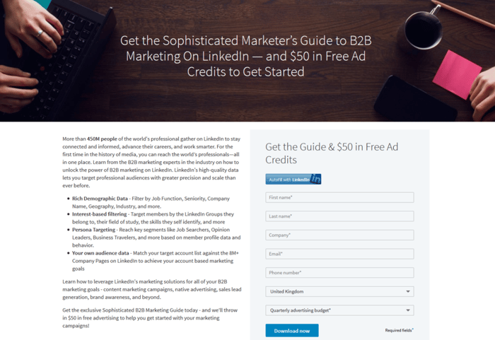
It's got a modern heading image, well-written copy and a simple call to action. There are no superfluous elements, and what's more important, you're not given a choice. There is just one CTA, and the page gives the visitor clear instructions as to what she needs to do to take action.
6. Misaligned marketing message
If you’ve done conversion optimisation and still don’t see the results, it’s time to look at the copy. The main problem with B2B copywriting for consultancies is that many business owners and marketing managers write copy for themselves. It may sound obvious, but you need to write for your buyer persona. Starting with your customer in mind is another reason why the concept of inbound marketing is so great – creating and understanding your buyer personas is one of the first steps in an inbound marketing strategy. If the page titles, headings and CTAs are misaligned or muddled, people won’t relate to your offering.
A while ago, businesses used focus groups or holding surveys to get people’s reaction to their website. Both cost a lot of money and take ridiculous amounts of time. There’s an excellent alternative solution called MTurk, a micro-task service owned by Amazon. It has hundreds of thousands of anonymous participants who will perform short, simple tasks for a reasonable amount of money.
Webmasters use MTurk to test different colour schemes, to gauge reaction to different marketing messages and most importantly, to hold mini-surveys. You can get anonymous web users to test your website and share their opinion. It’s a quick and affordable way to find out if people even understand what products or services your company offers.
7. The website doesn’t solve a problem
If a website is supposed to be generating leads, it must add value. Yes, a bit of self-centred bragging might be ok, but if your website is all about you and not about your ideal client, it won’t strike a chord with your visitors.
You may be selling the best service in the world, but unless you tell people how it will solve their problem, your landing page won’t convert them. Address people in a friendly manner, show them that you understand their pain points, prove that you have a solution, and you’ll see the conversions go through the roof.
8. Poor web design
Outdated or over the top design choices can drastically decrease your website’s lead generation ability. Even small details like colour choice or font face can impact your conversion rate. There are two quick wins here:
- understanding your buyer persona’s preferences and
- carrying out split-tests to determine the layout/colour combinations that lead to higher conversion rates.
We already mentioned MTurk. If you think you’ve already gone an extra mile to hone your conversion optimisation, just publish a quick survey on MTurk and see what it is that people hate about your site.
Here's another example of a poorly designed landing page.
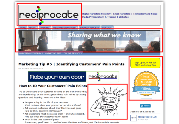
Although the page copy is not that bad, they've got four different visual styles going on. The CTA is totally unclear, and you get extra points for guessing what the blue banner says in the middle of the page. I can't figure it out!
9. The landing page is not mobile friendly
It’s no longer a secret that more people are accessing the web using mobile devices than the number of those who are predominantly using desktop devices. Yes, this will depend on your niche but with the global B2B space becoming more agile, there’s only one way this trend can go. In the newer and more tech-intensive niches, this proportion is hitting 70% or more.
The current benchmark for the Top 10,000 mixed niche websites is 56% of mobile vs desktop. LinkedIn reports show that 58% of its users use the site mobiles.
Delaying converting your web design team’s mindset to “mobile-first” will not only impact your website’s organic ranking but may also harm conversion rates.
The competition in most niches are so intense, and a visitor who hasn’t been happy with her user experience on a mobile device will not make the effort of revisiting the site on a desktop device. She will instead spend her time visiting your competitor’s website.
There is a lot to creating a high performing website, and with website design and best practices accelerating at light speed, it’s an area that you constantly need to keep on top of. This post provides you with the most critical areas that we find need addressing on the consultancy websites we work on at LexisClick. Remember to keep revisiting these points for your website so that it continues to perform at a high level for your consultancy.